
A flawed journey, beautifully designed, is still a flawed journey. Read our review of the onboarding journey from Wise.
What is the AAWE Score?
The AAWE Score is calculated by rating initial customer expectations as well as the reality of their experience, both out of 10. We then work out the difference between the two scores to give the final result.
Onboarding from Wise
The Expectation
We recently had the need to pay a supplier based in a different country. Our bank didn’t support direct payment to accounts in that country, so we needed to look into alternative options.
Wise was recommended by the supplier. We were familiar with Wise and in fact were happy to have an excuse to use it. Wise had often been put forward to us as a leader in customer experience within financial services. The work they have done to connect their visual identity to their interaction design is something we’d heard a lot about for example.
So, our expectations were high and we were looking forward to getting hands-on with an app we felt like we could learn a lot from.
Expectation Score: 8/10
The Reality
Functional can be effortless
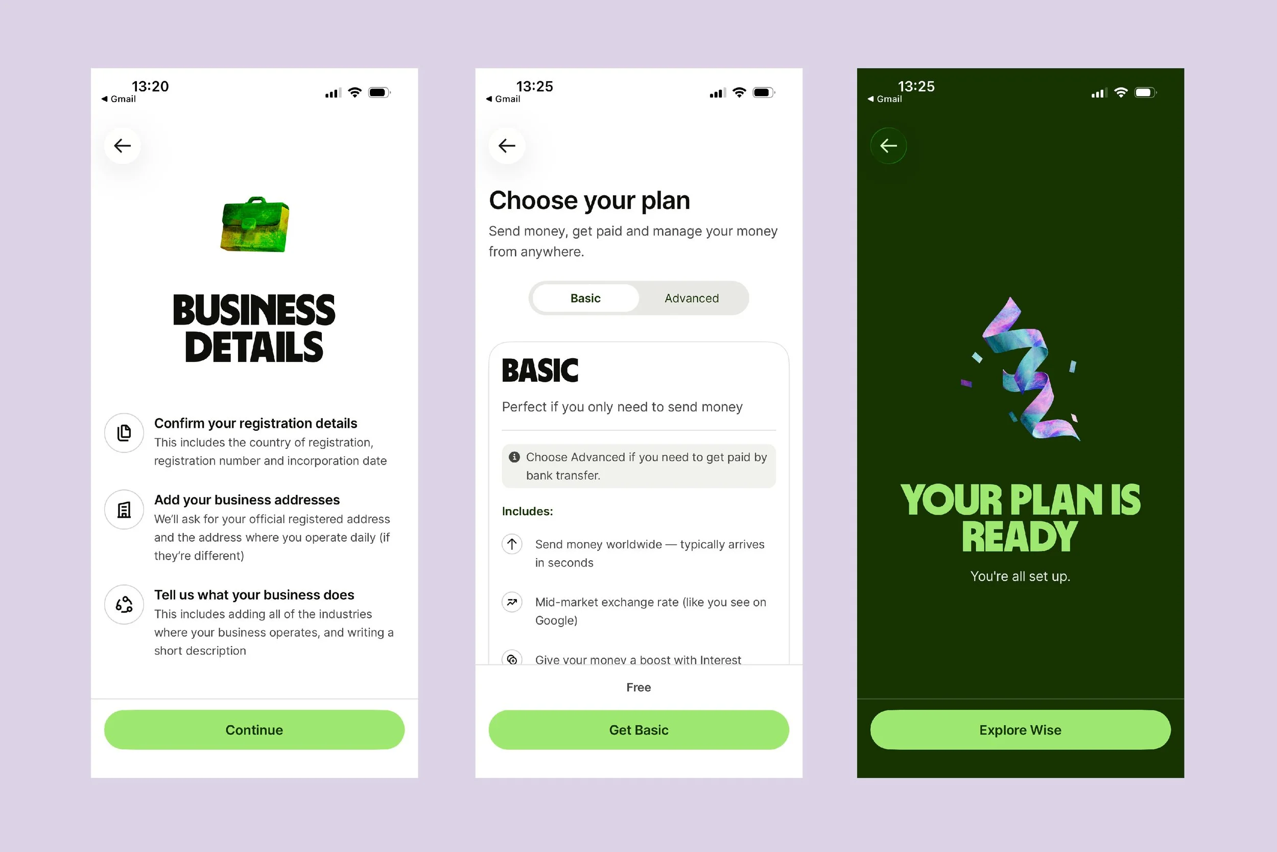
We started by heading to the app store. We quickly found the Wise app, downloaded it and began onboarding. The initial security steps were to be as expected and every effort was made to make each step as manageable as possible, despite the possibility for this to feel clunky and lengthy. We were able to register, verify our email address, verify our phone number, create a password, enable FaceID, and ask the app not to use ad tracking in the space of 2 minutes.
We then began to open a business account. The vast majority of the details needed were able to be taken from the Companies House register. A good reminder to use recognised data sources to pre-fill as much information as possible.
After that, it was simply a matter of putting in some personal information and selecting a plan and we were set up. All in all, despite this process taking 35 screens, an email and a text, it was able to be completed in just 6 minutes.
One thing to call out was in the presentation of the available plans. Wise offers two plans for business accounts. ‘Basic’ and ‘Advanced’. Basic is free whereas Advanced has a £50 setup cost. The plans were presented in the typical way with features listed, but on the Basic plan there was a callout to state that if you wanted to receive money via Wise, you’d need an Advanced plan. This was a simple but effective way of linking the most notable difference to a direct and often needed feature. Nice work.
We were asked to run before we could walk
The best thing to do to help customers become familiar with an app is to get them to start using it. No need to have a guided tour. Simply get customers using the features they want as quickly as possible. Wise did just that.
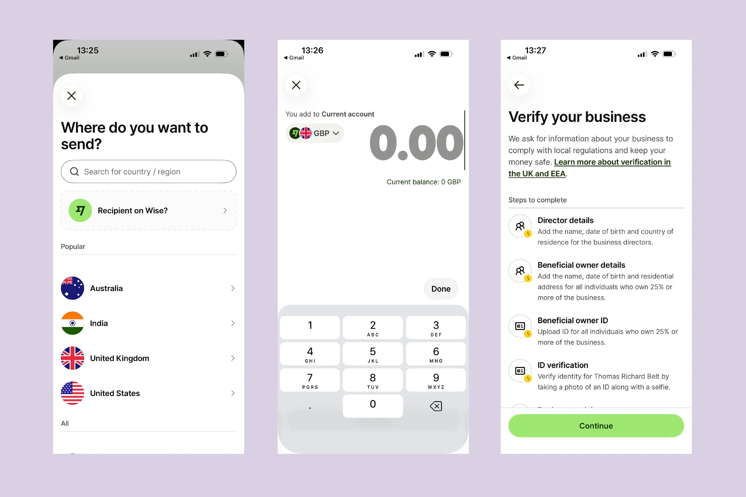
On opening the app for the first time we were presented with the start of the process to send money overseas. That’s exactly what we wanted to do so it was perfect.
However, that’s when problems started to occur. In going through the process we got to a certain point and were asked to verify our details. We started that process but many of the steps were repeated from what we had just done less than 2 minutes ago.
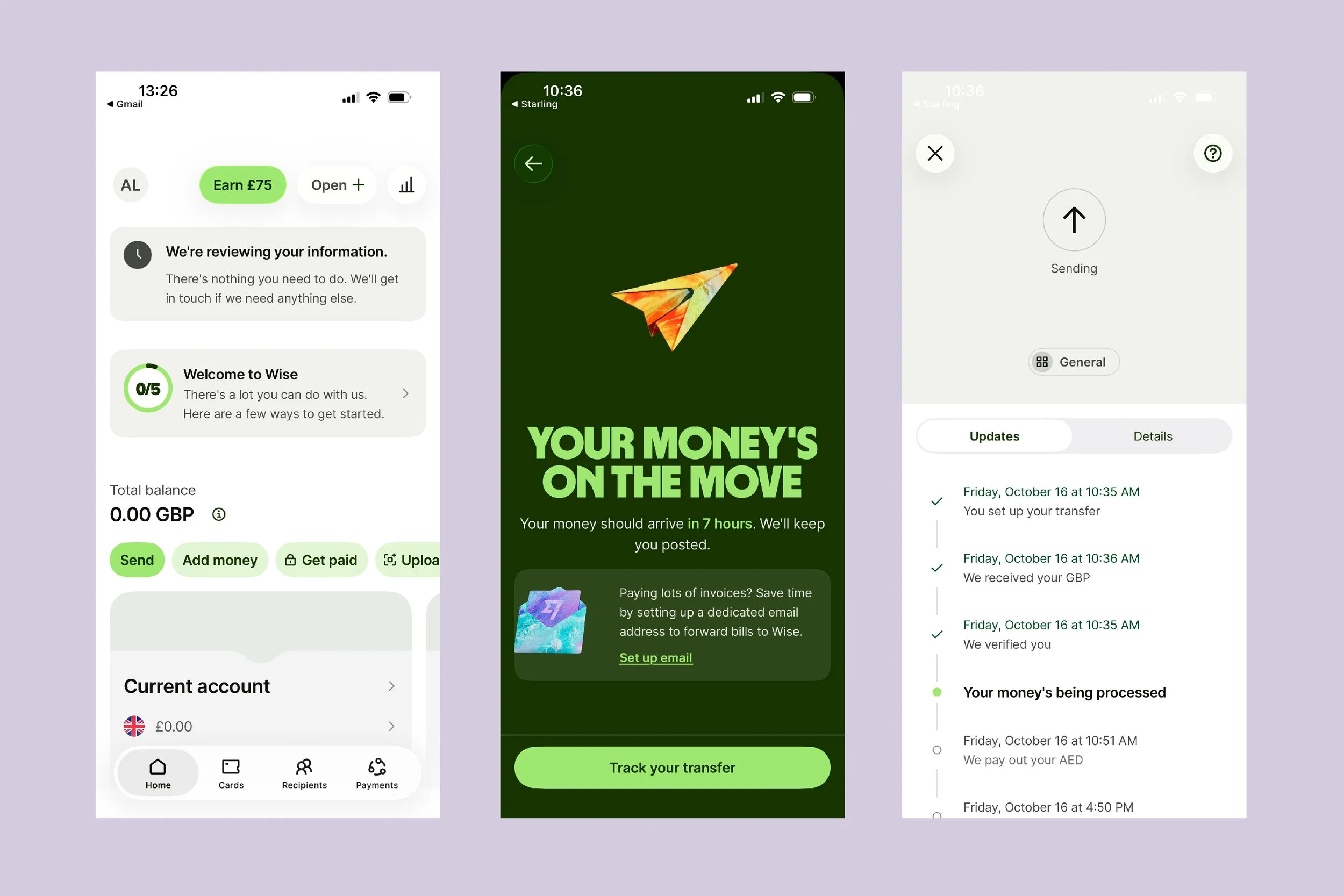
We decided to exit the process and return to the homescreen. On doing so, we could see a message stating Wise were reviewing the information we had provided. This message had a similar clock icon to screen where we were asked to verify our details. This gave us the sense that it was simply a matter of time and Wise would verify our account based on the info we had given. So we decided to wait as we expected to be contacted when we could start using the app.
Presented with a dead-end
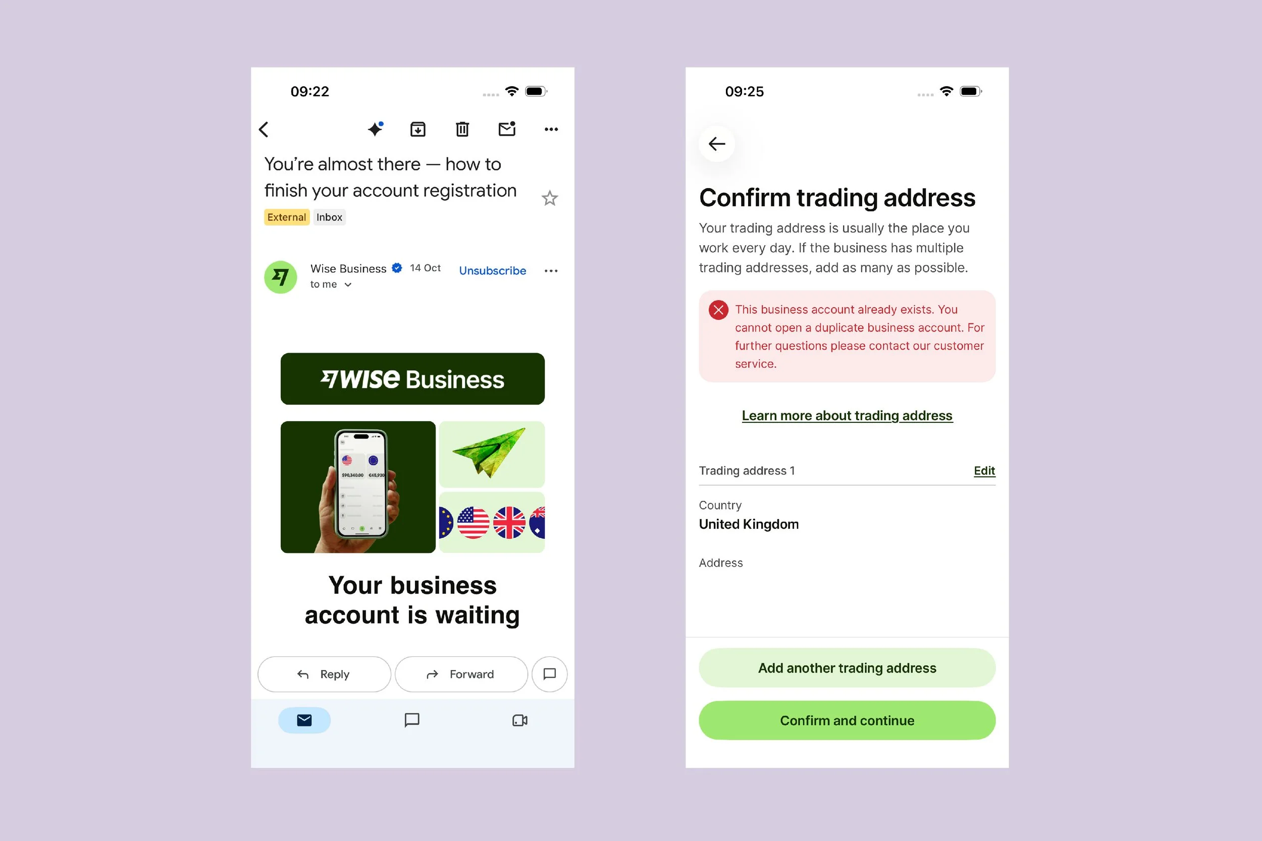
The first communication we received from Wise was an email stating we needed to finish our account registration.
When clicking the link in the email and being sent to the Wise app, we were again presented with the same set of screens we completed when we first accessed the app. We assumed this might be because the information may be required to be double keyed, so we entered our information again.
At the end of the process we were presented with an error message. It stated the details we provided were for a business account which already existed. Yes, we know. It’s ours! We were told we couldn’t open duplicate accounts (which we didn’t want to do) and would have to contact customer service.
We’re still unclear what purpose this email served if it was only ever going to lead to a dead-end within the experience. More should have been done to understand where we were in the onboarding journey, and a relevant and helpful communication should have been sent instead.
How we resolved things
We were left feeling there must be a simpler way to finish our onboarding and send the money we needed to.
So we opened up the app and saw on the homescreen there was a ‘Welcome to Wise’ message with links to complete tasks. One of which was to send money.
We clicked the link and were presented with screens we hadn’t seen before asking us to verify our identity via uploading a form of photo ID and a selfie. We were familiar with this as a required step in financial services apps and it felt like progress so we completed the process. Once again, it was beautifully designed and effortless to complete.
At the end of the process, we were finally able to send money overseas. We put in the country we were sending money to, uploaded an invoice which was used to pre-fill all the required information, connected Wise to our business bank account, and sent the money. All this took approximately 1 minute. A nice touch was a screen allowing us to see updates on our payment. As we were told the payment could take up to 7 hours this was a helpful step.
You can’t paint over the cracks
In the end, we were able to complete our journey. All the screens we interacted with were expertly designed and effectively communicated Wise’s brand, while being effortless to complete. A lot of credit has to be given to the thinking and craft used to design these interactions.
Nonetheless, a flawed journey, beautifully designed, is still a flawed journey. This illustrates why businesses need to understand the true reality of the customer experience, rather than simply designing expereinces in a way in which they believe is the reality.
We were asked to input the same information on multiple occasions, and presented with dead-ends. We were told our information would be reviewed, but never told when this was done. Finally, we completed the journey through luck rather than judgement. All of this could have been avoided.
If Wise paired their best-in-class design with a better understanding of the reality of the experience. This would have been a journey of serious note.
Reality Score: 6/10
The AAWE Score
Reality Score (6/10) - Expectation Score (8/10) = -2
Reality Score (6/10) - 1 = AAWE Score (5/10)
Opportunities for growth
Wise have nailed the form aspect of their customer experience. There are without doubt opportunities for growth when it comes to designing an experience more reflective of the functional reality of how customers can be onboarded.
1. Communicate what is happening
We were told our information needed to be reviewed. However, we weren’t told how long it would take, if we’d be contacted when it was completed, and if we were unable to use the app until it had been done. All of this could have been easily communicated to us and an email or push notification sent instead of the generic email we received asking us to complete our registration.
2. Create a single dynamic onboarding journey
The most frustrating element of this journey was the fact we were asked to input the same information again and again, with little sense of progress. Instead, a single journey should be created and the context of where the customer is on their journey used to always put them at the right step for them. This would ensure customers are never asked to put in information more than once and maintain a sense of progress, while allowing them to complete the process in small chunks.
3. All routes in should lead to the single journey
We had four separate attempts to complete the onboarding journey and send money overseas. All four attempts had different starting points and different steps. If a single dynamic onboarding journey was created, multiple entry points would be a strength rather than a weakness of the journey. Customers all behave differently so Wise needs to be able to support multiple forms of behaviour. But all entry points should point to the same destination, and that destination should be relevant no matter the customer and where they are in their onboarding journey.
Get our Newsletter
You can see a summary of all our future AAWE Scores in our regular newsletter, Touchpoint, along with CX tips, details of future events, and more. If you’re not already on our mailing list, you can sign up.